Using Color Theory to Create Harmonious Digital Scrapbook Pages
I am obsessed with color. I have very strong reactions to different colors, some add lots of stress to my life and some are so pretty I want to eat them (and they probably aren't the colors you're thinking of*). As a designer I love working with different colors and putting them together to see how they look together. Some color combinations are a creativity super boost and some will instantly halt a project. Why this happens seems to be mostly some sort of color magic, although color theory does exist, so I thought I would take a minute to look into it for digital scrapbooking.
One of the fundamental concepts of color theory is the color wheel. The color wheel shows the relationships between different colors and is made up of three primary colors (red, blue, and yellow), three secondary colors (green, orange, and purple), and six tertiary colors (red-orange, yellow-orange, yellow-green, blue-green, blue-purple, and red-purple). Understanding the color wheel is crucial to creating harmonious scrapbook pages.

Color Schemes
There are several common color schemes that you can use in your digital scrapbook pages:

creating a sense of unity and often found in nature


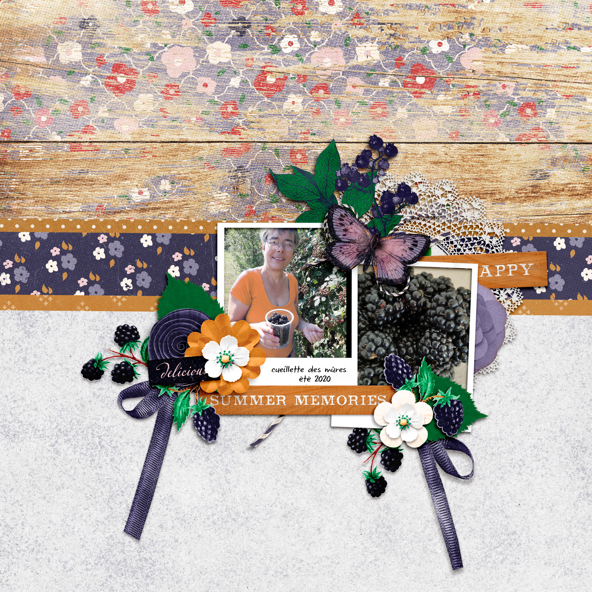
When choosing colors for your digital scrapbook pages, consider the mood or theme you want to convey. Warm colors like red, orange, and yellow create a sense of energy and excitement, while cool colors like blue, green, and purple create a sense of calm and relaxation. You can also use color to highlight or contrast certain elements on your page.


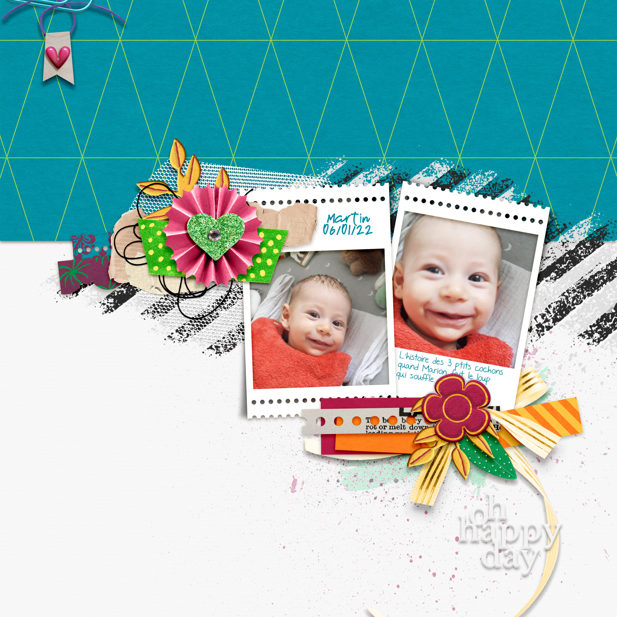
Applying Colors
Once you've chosen your color scheme, it's time to apply it to your digital scrapbook page. You can use color in a variety of ways.
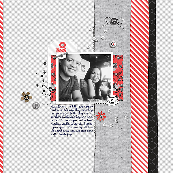
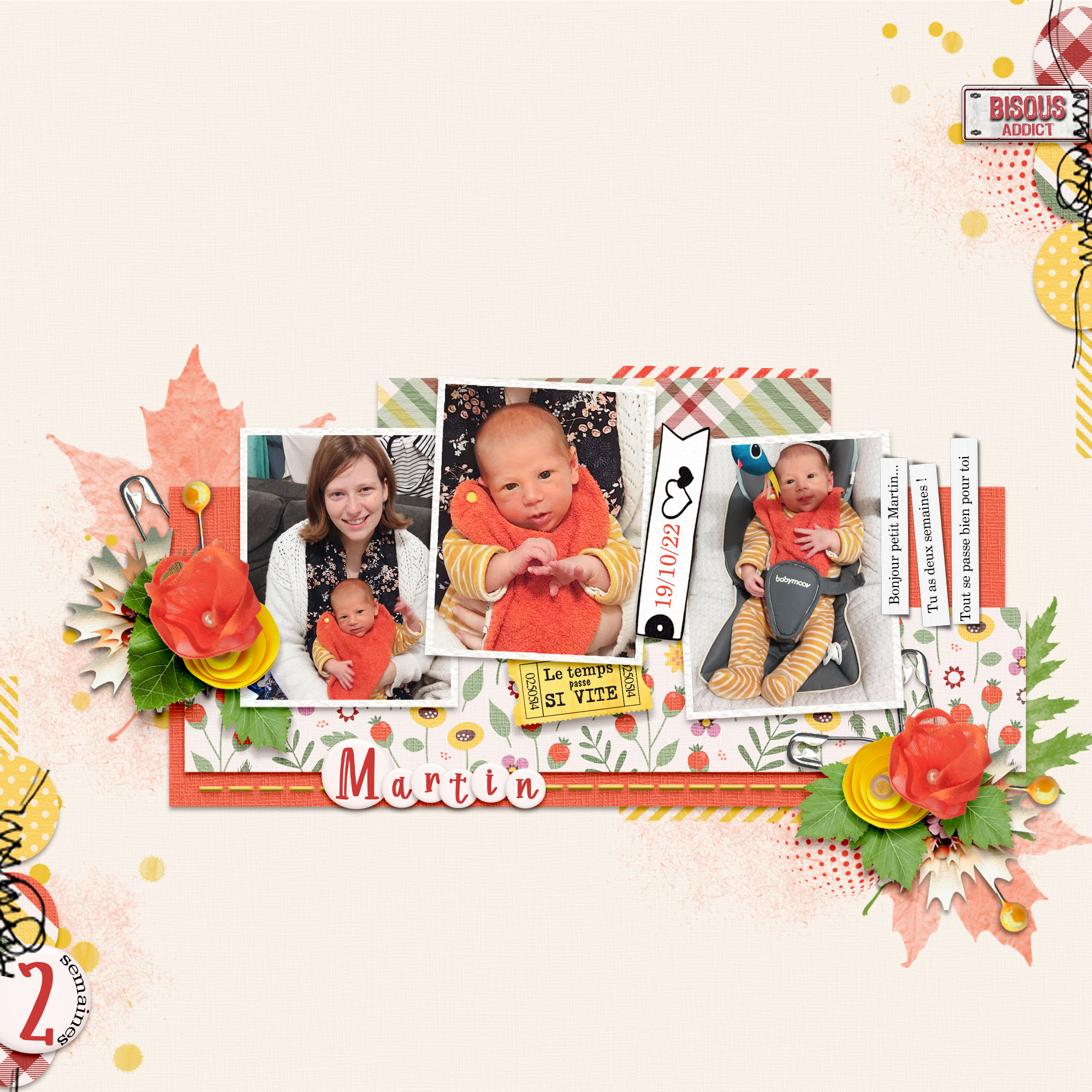
Once you've chosen your color scheme, it's time to apply it to your digital scrapbook page. You can use color in a variety of ways, such as matching the photo to the layout or matching the colors in the photos to the colors in the layout. Or you can scrapbook like me and just use whatever feels good. I hope a little color theory has maybe given you a clue about why you use certain colors more, or together. Let me know your color feelings below in the comments.
* Certain shades of blue really drive me crazy, in a bad way, and I don't like to be around them. This is a problem because it's a shade of blue that is very popular with most people and commonly found. Really bright colors, especially in certain combinations will make we want to eat whatever it is, even if it's on my computer.
Blog By
About Me
Hi There! I’m Marisa Lerin and you’ll see me around at DigitalScrapbook.com a lot. I started this site in 2010 soon after I discovered a new love in digital scrapbooking. DigitalScrapbook.com has gone through some significant changes since that time and it’s grown into this lovely community site you are seeing now. I am daily surprised by the turn of life’s events that has led me down this path. If you're new to the site, welcome! Here are a few tidbits about me that I hope will help you get to know me better!
I’m originally from Minnesota, USA, but spent a good chunk of my childhood living abroad (in Bolivia and Hong Kong). I returned to Minnesota to attend university, got married and then moved overseas again (Korea, then Jordan and 1 year of traveling). My designs are heavily influenced by these many nomadic years. I am currently back in the USA, now living in the great state of Oregon!
I have no official training for what I’m doing, since I decided very wisely (haha) to study physics in university. I am always learning new things about digital scrapbooking, and this community has been immensely helpful for that!
If I manage to stop digital scrapbooking you will probably find me watching TV, reading or baking. I also enjoy writing for the blog here at DigitalScrapbook.com where I talk about whatever happens to be catching my fancy at the moment.
Monthly archive
- November 2012 (9)
- December 2012 (37)
- January 2013 (17)
- February 2013 (13)
- March 2013 (20)
- April 2013 (26)
- May 2013 (29)
- June 2013 (9)
- July 2013 (8)
- August 2013 (13)
- September 2013 (16)
- October 2013 (14)
- November 2013 (16)
- December 2013 (12)
- January 2014 (15)
- February 2014 (9)
- March 2014 (15)
- April 2014 (11)
- May 2014 (4)
- June 2014 (9)
- July 2014 (8)
- August 2014 (7)
- September 2014 (8)
- October 2014 (13)
- November 2014 (6)
- December 2014 (3)
- January 2015 (13)
- February 2015 (14)
- March 2015 (14)
- April 2015 (13)
- May 2015 (12)
- June 2015 (11)
- July 2015 (10)
- August 2015 (8)
- September 2015 (7)
- October 2015 (10)
- November 2015 (8)
- December 2015 (10)
- January 2016 (7)
- February 2016 (6)
- March 2016 (8)
- April 2016 (7)
- May 2016 (8)
- June 2016 (8)
- July 2016 (6)
- August 2016 (5)
- September 2016 (8)
- October 2016 (8)
- November 2016 (11)
- December 2016 (7)
- January 2017 (6)
- February 2017 (12)
- March 2017 (10)
- April 2017 (7)
- May 2017 (9)
- June 2017 (9)
- July 2017 (10)
- August 2017 (7)
- September 2017 (11)
- October 2017 (8)
- November 2017 (9)
- December 2017 (8)
- January 2018 (8)
- February 2018 (8)
- March 2018 (8)
- April 2018 (4)
- May 2018 (9)
- June 2018 (9)
- July 2018 (4)
- August 2018 (5)
- September 2018 (13)
- October 2018 (19)
- November 2018 (18)
- December 2018 (14)
- January 2019 (23)
- February 2019 (20)
- March 2019 (17)
- April 2019 (14)
- May 2019 (17)
- June 2019 (14)
- July 2019 (8)
- August 2019 (3)
- September 2019 (14)
- October 2019 (17)
- November 2019 (16)
- December 2019 (6)
- January 2020 (14)
- February 2020 (20)
- March 2020 (16)
- April 2020 (18)
- May 2020 (19)
- June 2020 (16)
- July 2020 (8)
- August 2020 (5)
- September 2020 (8)
- October 2020 (10)
- November 2020 (10)
- December 2020 (7)
- January 2021 (4)
- February 2021 (9)
- March 2021 (8)
- April 2021 (7)
- May 2021 (7)
- June 2021 (7)
- July 2021 (10)
- August 2021 (7)
- September 2021 (8)
- October 2021 (5)
- November 2021 (7)
- December 2021 (6)
- January 2022 (5)
- February 2022 (7)
- March 2022 (9)
- April 2022 (6)
- May 2022 (7)
- June 2022 (4)
- July 2022 (2)
- August 2022 (1)
- September 2022 (3)
- October 2022 (6)
- November 2022 (4)
- December 2022 (6)
- January 2023 (4)
- February 2023 (5)
- March 2023 (6)
- April 2023 (5)
- May 2023 (5)
- June 2023 (5)
- July 2023 (5)
- August 2023 (5)
- September 2023 (5)
- October 2023 (4)
- November 2023 (4)
- December 2023 (5)
- January 2024 (4)
- February 2024 (5)
- March 2024 (5)
- April 2024 (2)



Recent Comments
I can tell when something is well done, but creating is a whole different ball game! This is very helpful - thank you!
Beautiful. I love color too!
very good
@Christina: I don't know if I like candy because it's brightly colored, or I like bright colors because it reminds me of candy.
Beautiful. I love color too! Thanks for sharing these lovely layouts.
Great post Thanks
I can't stop laughing at you wanting to eat colors. LOL Is it that they remind of brightly-colored candy? When I see pink, I think of bubblegum and cotton candy, and in turn it reminds me of my childhood and fun times at fairs.
I do love the monochromatic look. It's funny you mention relaxing colors, because that's how Jessica's kits always make feel: Homey and comfy. Rachel always uses bold, bright colors, which are fun, energetic, and playful. Your color choices make me feel happy and serene, and they always work so well together.
Matching the photo colors to a kit's colors is something I enjoy doing. I'll often choose a photo, then try to find a kit that has similar colors.
What great layouts showing all the colour combinations. Blue is my favourite colour in various shades and I will usually do a blue layout whenever there is a monochromatic challenge. Thank you for picking my layout too.
Thank you for this great information! I appreciate the time you spend to enlighten us each day. I love bright colors and really enjoy the things you put together.
More and more I crave bright colors in my own pages too. Experimenting with colors can get me out of a blue funk better than any drug over could. :)
Thank you Marisa for this little color excursion and your preferences.
Colors are waves of light that affect the soul.
I like the pure colors and especially all shades of red. Also white and black or black and white as a mix. What creates my inner defense are earthy colors and especially the olive. It's a military color and that means death to me. I've never had any olive-colored clothing in my life. From the blue I only like the light blue, royal blue and the petrol blue (tertiary colors) less the navy blue.