
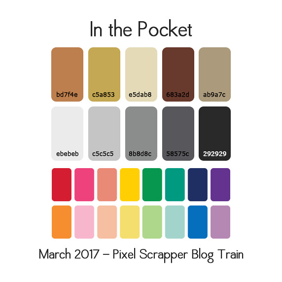
The March blog train will be a focus on stash-building and pocket scrapping items. Neutral and commonly used items are appreciated. A bit different from our usual thing, I think people will enjoy this switch up. Please use the colors provided sparingly, as we're really focusing on neutrals this month.
(Would someone update the color # on the rest of the palettte? I used the font Verdana, which should be available to everyone.)
Please read the new guidelines before finishing your contribution.
Feel free to pin inspiration to our Pinterest board. If you'd like to be added to the board, please leave me a comment here (make sure you are following the board, or else I can't add you).
Yay! Marisa, I see you've created working threads for April & May, too! I'm off to check them out now! This one's going to be really interesting to do.
Is there a list pocket-scrapping sizes people feel are useful? I don't pocket scrap, so have no idea where to start...
ACO File
So is this like a 'scrapping basics' type of theme? I'm not familiar with pocket scrapping either, so I'm a little out of the loop. Stash-building, to me, sounds like template creating which I don't think is the right direction.
This theme would call for basic things that go with just about any kit? Such as, days of the week/month/year tags/cards, common phrases, buttons, shape doodles, frames, brush strokes, scatters, washi tape, strings, stitches, etc?
As Laurel asked, if there are specific sizes that are useful, that knowledge would also be very helpful!
Yay! I'm excited!
@Laurel Pocket cards are usually a variety of sizes: 3"x4"/4"x3" or 4"x6" / 6"x4" or square 3x3 or 4x4. Basically it's focused on scrap pages with a pocket-style layout (which I think project life really made popular). Here are some PS pocket style kits.
And some layouts to see how things are used.
Hope that helps.
Great explanation and links, Amanda.
As a scrapper (LOL) and not a digital designer here is what I think 'stash' is about? My stash is full of papers and elements (especially stickers) that seem to go with just about anything and anywhere. Especially helpful are things in neutral because I can use them to enhance my pages without them competing with my colors or main focus. We are a camping & outdoorsy family so things like trees (I love birch trees - off white & little brown markings) or wildflower clumps in muted colors or birds that have a splash of color against a brown body always work well. Things that are common place but not always easy to find like raindrops on trees or leaves or a rainbow refracted in a waterfall or even a mud puddle. A long winding road surrounded by bush, a house or town/city on the horizon, a rainbow, a waterfall, a sand castle, a small hill with a path going up it are all things that work to beautify pages. .... I hope it is helpful to someone. If not... thank-you for the 'journey' through my stash to help define it.
Little metal brads or charm shapes (like a key, pen, cell phone, coins or other things we put in our pockets or a, car, truck, trailer, fishing pole, axe, heart, daisy, gardening hand tools, stars) that suit many layouts. Other basic elements are butterflies, hearts, dogs, cats, although they don't all work too well in neutrals. Some that do though are music notes, balloons, gulls in flight, fall leaf wreath or swag, bowties, some sports equipment, vintage effects.
I have come to love! journal cards and I think plain ones in neutral colors with a splash of color as a border or on the corners would be useful. Ones in slightly different sizes but complimentary colors (lt & dark of a color) would be awesome! Even better would be JCs that are already layered with the offsetting light & dark of a color. Then it could be jazzed up by the user with brighter colored elements, etc. It is great to have a nice mix of JCs that are both plain and have some words on them so phrases like 'On Vacation', At the Beach', 'In the Garden', 'Floral Fantasy' 'Down & Dirty' or words like sunshine, rainfall/drops/bows, clouds are all useful. JCs that say 'Before' & 'After' would also be welcome.
And black and white is of course very elegant for invitations or phrases & words that suggest that.
So now that I have gone through my stash so I could write this
LOL
Gayle
That was perfect Gayle! Thank you for all the ideas
toughie...
YVW.
i kind of go along with Gayle. Elements that could be used for just about any theme. Nature elements like trees, grass, clouds, sun, moon, stars, etc. Simple shapes. Maybe even some simple everyday items like cars, houses, items of clothing or even basic characters (mom, dad, etc,) Things like these would be something I would "stash" away to have for frequent use. Still, I know that whatever the designers come up with will be useful and wonderful.
Standard pocket card sizes are 3"w x 4" tall, 6"w x 4" tall, and 4"x4". I've seen some people use 1x1, 1x2, 1x3, 1x4, 2x2 and 2x3 strips to create less-standard pocket layouts as well as 3x3 cards (which can be scaled down from 4x4s).
Week numbers 1-52 and date numbers. I'd also include spring/summer/fall/winter in there.
Common phrases are good for anyone, pocket or traditional scrapper alike (any pocket scrapper can overlay word art on a simple paper card).
Charms or alphas that can go with any kit, like black on chipboard, or stamped metal charms in silver, brass, copper, or bronze tones.
Simple cards meant for journaling, with or without lines or a light grid.
Doodled frames that can be placed on top of a photo are great, as are frames sized to the 3 primary sizes.
Overlays that put a word in the middle of a photo so the image becomes the "paper" of a journal card.
Buttons, a flower or two, a small lace doily, weather icons, brads, flairs, washi tape, stitches, staples, lace and ribbon strips, banners, seasonless charms like keys or hearts or stars or 4-leaf clovers...
One of the things I like in pocket scrapping is the little stitched-down plastic shapes with glitter/beads/confetti/charms inside.
Templates are a good idea too, though--there never seem to be quite enough templates out there! And I'm not talking just pocket page layouts (especially with the plastic overlays and stitching!) or journal card layouts, though they'd be fantastic here. A set of plain card shapes in each size above with all the corners rounded to the same radius would be super-useful, perhaps one set with 1/4" radius and one with 1/2". Maybe a stack of scalloped circles/squares/ovals in different sizes (like a traditional scrapper's nesting punches). I've also been known to do 4x6 brag book layouts in place of some journal cards; perhaps some multi-photo cards with a few photo spots each would be great for when you've got a lot of photos from something but they don't warrant adding two pages to the layouts about an event, like a trip to the botanical gardens where you want to give the impression of something gorgeous everywhere you look?
Awesome ideas here, Holly. I especially like your frames & overlays suggestions.
I don't know anything about pocket scrapping, either, so all these suggestions will come in very handy! I googled "pocket scrapbooking" to get some idea of what to do, card sizes etc, and I'll be doing a bundle (I've already started on the papers), and I'll create some of the elements with the papers to get a uniform look. I'm just using the brown tones, not the greys, and have picked out a couple of the pop colours, but I'm not really sure how I'll use those extra colours yet. More thinking to do!
Is there a rule on textures for pocket scrapping? I'm not sure if I should be texturing my pieces as normal or if these are more likely to be printed, etc.
As a hybrid scrapper (I lay things out on the computer but print everything & put it together the old-fashioned way), I'd like to request that things also be offered flat for printing as often as possible (eg adding brads & flairs as the "before" the style/action is added to kits as well as including the flairs/brads). I know not everyone can do this (because it's more work & makes for larger kits) but I thought I'd ask!
I don't do pocket scrapping but my style, even before Becky Higgins created Project Life, has been to scrap each page on a grid. Photos (plural) & the story about them is the most important thing for me to scrap so here's what I'd love most from designers:
The thing I use the most, & oddly have the least of, are journal cards - & by this I mean ones I can journal on (cards with a largish blank or lined area & only a wee bit of decoration - a border/frame or smallish image like a bird or flower or something generic) rather than what I call filler cards (ones with sayings, illustrations etc). I love & use filler cards but I have masses & would love a much wider variety of useful journal cards (as in ones that are highly flexible &, to coin a word, unthemed).
And while I'm wishing, I'll add that I'd also love some 8.5x11 pocket-style page layout templates.
I'm really looking forward to seeing what everyone comes up with!
Thanks for your input Sarah
Quite a few trains ago you asked for flat brads so I've always included flat brads since then I also always try to include 1 or 2 blank journal cards in my kit along with themed journal cards. It makes me happy that I'm already somewhat there with your suggestions!
Kayl - you were one of the people I was thinking of when I mentioned the flat brads/flairs. You & Marisa have been wonderful about providing bits I can use really easily & I am deeply appreciative! I am way behind in going through the last 2-3 months worth of kits (more like 3-5 months ) so I'll have to dig through them for your journal cards when I get a chance, so thanks for reminding me!!
Hopefully I'm on the right track here...
Weeks 1-52, years 2015-2020, Sunday-Saturday, January-December, Winter-Autumn/Fall, as well as common adjectives & phrases!
I'd like to make a bunch of washi tapes or journal cards as well. I keep telling myself 'this month will be the month my kit is small' but.. that month never quite comes.
I might set up an action to scale these down to 3x3 and package/offer them up separately.
Nice Kayl! I like these!
Thanks, Erin
I've also been working on some age cards for baby photo shoots:
There will be: 1 week to 20 weeks and 1 month to 12 months. Each card is 6 inches wide by 4 inches high, and I'll provide the individual files so they can be used in pockets, as well as printable PDF files in both A4 and US Letter sizes (2 cards to a page). If you need different paper sizes, just let me know the measurements, and I'll offer that as well if I can.
These cards would also work for pregnancy 'bump' photos.
I'm glad you're doing baby cards! I did some as well but don't know if I'll end up posting/sharing them.. I've stuck to the grayscale colors and I just feel weird about it being grayscale and so basic. I guess because they aren't colorful they don't have that happy, baby, exciting feel to them. I might try and work on them but yours looks great and I'm happy they will be provided!
Thanks, Kayl! I've seen the baby cards in black and white graphic designs, so I didn't want to copy them completely. The background I've used is actually the Leopard one that comes with Elements 11, just converted to grayscale, then back to RGB. (I've done that with all of the PSE 11 backgrounds, and often use them as textures.) The 'leopard' might be appropriate, as babies can be 'wild things'!
Other than these cards, I'm using the brown shades, as the grays feel too much like templates to me, but I have absolutely no idea how to use the "Pop" colours, so I might not even include them.
This is what I have so far. I don't do pocket scrapping, so I hope this is the direction you were looking for...
Looks awesome, Rachel
I did a set of pregnancy week cards. "Week *number*, baby is the size of a *insert fruit*"
I did them in the grayscale theme and I'm thinking of just providing them as a giant PSD.. or maybe PNGs.. I'm so unsure with this theme and palette!
Nice that you are leaning towards the browns, I see what you mean with the grayscale feeling too template-y.
@Kayl - feel free to do things in all the browns instead of grey scale & add pops of the color as you go. Neutral doesn't have to be grey scale & browns can look great together (which surprises me as I used to LOATHE browns). And I really like what you've done so far!
@Rachel - that's fabulous! As a pocket-ish hybrid scrapper, I can't wait to get my greedy little mitts on your kit!!
I've been working on:
Year Cards (I'm doing the years 1950 to 2050)
Cards for the 12 months
Cards for 31 days in the month
Cards for 52 weeks in the year
Journal Cards (blank)
Filler Cards (words & phrases)
I'm also working on papers, which I probably won't offer for the blog train, but as co-ordinating kits on my freebie thread. Maybe also brads, buttons, flairs and borders - not sure yet!
I'm only using the browns, and have definitely decided not to use the "pop" colours - my brain can't seem to handle them at the moment! Too many decisions! Which one to use, where to use it...
It's surprising how many combinations you can make, just with those five browns! Everything will be CU, too, as I'm using my own templates again.
Pages