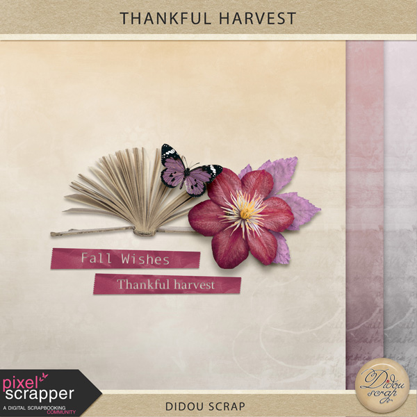
@Dawn, Thank you. I wanted something really soft. I'm glad you liked it. For me, they are always the best part of produce! Ah! I also loved yours papers!!!
Great work ladies! I have to say I love these colors! And all the submissions are quite pretty! I went with a kitcheny twist on this theme. The recipe book scan is actually from my personal collection. The book dates 1824 so who knows how old these handwritten recipes are
Wow, so many gorgeous kits!!! I made just a little something as this train is going to be huge!! Shadows are for preview only. This will be available on my blog November 1.
So until the last few days I've never even opened any editing software, but since I want to succeed, I hope I'm doing this correctly. All papers are 12x12 and 300dpi. I haven't gotten the hang of anything but these papers so any feedback would be greatly appreciated. I'm also completely confused about the QC aspect of this, so I hope they are good enough to use. There are 26 papers, 13 solids and 13 patterned. Here's my preview:
One more thing, right now I'm using GIMP and Silhouette Studio. I am trying to keep up, but a lot of what I find is about Photoshop so if you know of any tutorials I would love them.
I love the papers, Erin P! I can see pattern and texture on the preview, so you're good there. As far as QC, you want to make sure there are no stray pixels, no missing pixels, no outside shadows, and that everything is saved at 300dpi in RGB colorspace, in either high-quality JPG (if it doesn't have transparent parts) or PNG (if you need transparency). "High-quality" is basically a step below the maximum your software will do: 10 on Photoshop, which goes up to 12, but I don't remember how GIMP's scale goes for that.
You also want to gamut-check everything prior to release, but GIMP can't do that, so what some GIMP users here do is send a copy to someone who uses Photoshop and is willing to handle the gamut checking for them. (Gamut is a reference to whether a color is in the colorspace you're using, so it'll print the same as it looks on screen rather than going some funky off-shade or losing brightness.) Most of the colors in this palette aren't ones where you'll need to worry about gamut, since they're all muted, but you should check them anyway to be sure. Bright colors are especially likely to go out of gamut when you add textures or shadows, though, so file that away for next month's blog train, as there are lots of brights there!
As far as getting the hang of digital graphics stuff, it takes a while. These papers look as good as some that I've seen for sale in stores, and awesome for a first attempt. There's room for improvement, of course; using a grayscale overlay to give it a slightly less uniform look, or stamping on some grunge brushes to do the same thing would take them to the next level.
Elements are trickier--to create new ones, you need to either draw them with a graphics tablet or mouse, or extract them from photos and recolor them. Luckily, there's a big variety of grayscale templates in the Graphics section here that you can download and recolor to give yourself a start.
If you can afford it, Adobe's got a Photoshop/Lightroom only subscription that's $20/month. As much as you can do in GIMP, Photoshop's got a much better menu system, and has a couple of really useful features for scrapbooking (clipping masks, for one! Doing them in GIMP is about 10 steps, where in Photoshop it's just alt-click between the layers in the Layers palette. SOOOO much easier.) Photoshop Elements is about $99 on Amazon, too, and if you're really unable to afford either, there's an old version of Photoshop (CS2) available from Adobe for free. And yes, I'm a former GIMP user--going to Photoshop made a night-and-day difference in how much I could get done in a day.
Hey, Erin. The bone spurs in my neck are making my hands jerk a lot more again, so drawing has been difficult. Some days are better than others, but I spent yesterday drawing stuff for December, so that's an improvement! At least I know I'll have some elements for that one. Still stuck on November's--the colors are proving troublesome to design elements with--but I've got a few nice pieces of word art coming for this one so far.
I've also been learning Illustrator, which I can do with a mouse when my hands are jerking so that I can't draw. At this point, I can create line art and color it in, and make patterns. I haven't yet gotten to being able to texture things, but at least I'm able to create them, and if nothing else I can spend a day texturing in Photoshop once I have everything drawn. And OMG, Illustrator patterns beat Photoshop tiles hands down!
I haven't used AI since I was in college 10 years ago. I'm cheap and don't want to pay for it, but vector images are just so neat. It just makes sense to use them to make patterns. Hope you feel better and get to spend time making stuff. Spending time creating is one of the best things!
Thank you so much Holly! I really admire your work so knowing your opinion helps a lot. Right now I don't know if this is something I want to get into enough to warrant the purchase of Photoshop, but it's definitely an option if I get very far into this. I thought about adding some fades to the edges to give it a more finished look, but I wanted to see what people thought before I got too far. Thanks again!
Dawn , I love your journal cards.
@ Robin, what a delightful kit!! I love the scarecrows and the pumpkins!!
@Tamara, your papers are so soft and so very beautiful!!
@ Betsy, fantastic word art!!
@Kiana, beautiful elements and fantastic elements!!
@Dawn, Thank you. I wanted something really soft. I'm glad you liked it. For me, they are always the best part of produce! Ah! I also loved yours papers!!!
Thank you Turdette. You are so sweet!
Thank you, Trudette, it always thrills me when anyone says they like what I've made!!
Dawn, Thank you so much for your lovely compliment! I really like your different burlap pieces. Very unique!
Thank you much Dawn!
Great work ladies! I have to say I love these colors! And all the submissions are quite pretty! I went with a kitcheny twist on this theme. The recipe book scan is actually from my personal collection. The book dates 1824 so who knows how old these handwritten recipes are
I'll have it up on victorianpassage.com Nov 1st
Jessica , what a beautiful take on the subject , love the Victorian feel you created.
My part!
Dorine, that is so pretty! I love it!!
Dorine, so nice what you made , realy serene.
Thank you!
Dorine, and everyone else contributing...THANK YOU VERY VERY MUCH!!
@Jessica! I love your kit! It's lovely!
Fabulous kit ladies.
Here is what I made:
@Trudette & Erin - Thank you so much!
@Dorine & Liza - Wonderful contributions!
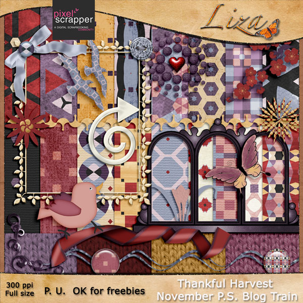
This kit is beautiful Liza..Colors are so cheerful.
BTW, didn't see you around from some time..it's good to see you and your work again. .
Thank you very much Jessica. Your part looks fantastic.
Thank you Sherry. Not enough time these last months.
It get better and better,
love all what you guys made so far !
Wow, so many gorgeous kits!!! I made just a little something as this train is going to be huge!! Shadows are for preview only. This will be available on my blog November 1.
So until the last few days I've never even opened any editing software, but since I want to succeed, I hope I'm doing this correctly. All papers are 12x12 and 300dpi. I haven't gotten the hang of anything but these papers so any feedback would be greatly appreciated. I'm also completely confused about the QC aspect of this, so I hope they are good enough to use. There are 26 papers, 13 solids and 13 patterned. Here's my preview:
One more thing, right now I'm using GIMP and Silhouette Studio. I am trying to keep up, but a lot of what I find is about Photoshop so if you know of any tutorials I would love them.
I love the papers, Erin P! I can see pattern and texture on the preview, so you're good there. As far as QC, you want to make sure there are no stray pixels, no missing pixels, no outside shadows, and that everything is saved at 300dpi in RGB colorspace, in either high-quality JPG (if it doesn't have transparent parts) or PNG (if you need transparency). "High-quality" is basically a step below the maximum your software will do: 10 on Photoshop, which goes up to 12, but I don't remember how GIMP's scale goes for that.
You also want to gamut-check everything prior to release, but GIMP can't do that, so what some GIMP users here do is send a copy to someone who uses Photoshop and is willing to handle the gamut checking for them. (Gamut is a reference to whether a color is in the colorspace you're using, so it'll print the same as it looks on screen rather than going some funky off-shade or losing brightness.) Most of the colors in this palette aren't ones where you'll need to worry about gamut, since they're all muted, but you should check them anyway to be sure. Bright colors are especially likely to go out of gamut when you add textures or shadows, though, so file that away for next month's blog train, as there are lots of brights there!
As far as getting the hang of digital graphics stuff, it takes a while. These papers look as good as some that I've seen for sale in stores, and awesome for a first attempt. There's room for improvement, of course; using a grayscale overlay to give it a slightly less uniform look, or stamping on some grunge brushes to do the same thing would take them to the next level.
Elements are trickier--to create new ones, you need to either draw them with a graphics tablet or mouse, or extract them from photos and recolor them. Luckily, there's a big variety of grayscale templates in the Graphics section here that you can download and recolor to give yourself a start.
If you can afford it, Adobe's got a Photoshop/Lightroom only subscription that's $20/month. As much as you can do in GIMP, Photoshop's got a much better menu system, and has a couple of really useful features for scrapbooking (clipping masks, for one! Doing them in GIMP is about 10 steps, where in Photoshop it's just alt-click between the layers in the Layers palette. SOOOO much easier.) Photoshop Elements is about $99 on Amazon, too, and if you're really unable to afford either, there's an old version of Photoshop (CS2) available from Adobe for free. And yes, I'm a former GIMP user--going to Photoshop made a night-and-day difference in how much I could get done in a day.
Holly, I'm glad to see you comment. I've been wondering if you are feeling better.
Hey, Erin. The bone spurs in my neck are making my hands jerk a lot more again, so drawing has been difficult. Some days are better than others, but I spent yesterday drawing stuff for December, so that's an improvement! At least I know I'll have some elements for that one. Still stuck on November's--the colors are proving troublesome to design elements with--but I've got a few nice pieces of word art coming for this one so far.
I've also been learning Illustrator, which I can do with a mouse when my hands are jerking so that I can't draw. At this point, I can create line art and color it in, and make patterns. I haven't yet gotten to being able to texture things, but at least I'm able to create them, and if nothing else I can spend a day texturing in Photoshop once I have everything drawn. And OMG, Illustrator patterns beat Photoshop tiles hands down!
I haven't used AI since I was in college 10 years ago. I'm cheap and don't want to pay for it, but vector images are just so neat. It just makes sense to use them to make patterns. Hope you feel better and get to spend time making stuff. Spending time creating is one of the best things!
Blog code: <a href="http://www.darciedeann.wordpress.com/" target="new">Darcie Deann Designs</a>
Thank you so much Holly! I really admire your work so knowing your opinion helps a lot. Right now I don't know if this is something I want to get into enough to warrant the purchase of Photoshop, but it's definitely an option if I get very far into this. I thought about adding some fades to the edges to give it a more finished look, but I wanted to see what people thought before I got too far. Thanks again!
Pages