Layout Critique #4
This week's layout comes from Harriett.
Please follow the directions carefully. Be specific and make a "good feeling sandwich" (something you like, something you'd improve, something you like). Comments that do not follow the guidelines may be deleted.
I'm hoping to make this a regular feature on the blog. If you'd like to submit a layout for critique please email it to me at [email protected]
Blog By

Subscribe to this blog
![]()
![]()
My Projects


Follow Marisa Lerin
Monthly archive
- November 2012 (9)
- December 2012 (37)
- January 2013 (17)
- February 2013 (13)
- March 2013 (20)
- April 2013 (26)
- May 2013 (29)
- June 2013 (9)
- July 2013 (8)
- August 2013 (13)
- September 2013 (16)
- October 2013 (14)
- November 2013 (16)
- December 2013 (12)
- January 2014 (15)
- February 2014 (9)
- March 2014 (15)
- April 2014 (11)
- May 2014 (4)
- June 2014 (9)
- July 2014 (8)
- August 2014 (7)
- September 2014 (8)
- October 2014 (13)
- November 2014 (6)
- December 2014 (3)
- January 2015 (13)
- February 2015 (14)
- March 2015 (14)
- April 2015 (13)
- May 2015 (12)
- June 2015 (11)
- July 2015 (10)
- August 2015 (8)
- September 2015 (7)
- October 2015 (10)
- November 2015 (8)
- December 2015 (10)
- January 2016 (7)
- February 2016 (6)
- March 2016 (8)
- April 2016 (7)
- May 2016 (8)
- June 2016 (8)
- July 2016 (6)
- August 2016 (5)
- September 2016 (8)
- October 2016 (8)
- November 2016 (11)
- December 2016 (7)
- January 2017 (6)
- February 2017 (12)
- March 2017 (10)
- April 2017 (7)
- May 2017 (9)
- June 2017 (9)
- July 2017 (10)
- August 2017 (7)
- September 2017 (11)
- October 2017 (8)
- November 2017 (9)
- December 2017 (8)
- January 2018 (8)
- February 2018 (8)
- March 2018 (8)
- April 2018 (4)
- May 2018 (9)
- June 2018 (9)
- July 2018 (4)
- August 2018 (5)
- September 2018 (13)
- October 2018 (19)
- November 2018 (18)
- December 2018 (14)
- January 2019 (23)
- February 2019 (20)
- March 2019 (17)
- April 2019 (14)
- May 2019 (17)
- June 2019 (14)
- July 2019 (8)
- August 2019 (3)
- September 2019 (14)
- October 2019 (17)
- November 2019 (16)
- December 2019 (6)
- January 2020 (14)
- February 2020 (20)
- March 2020 (16)
- April 2020 (18)
- May 2020 (19)
- June 2020 (16)
- July 2020 (8)
- August 2020 (5)
- September 2020 (8)
- October 2020 (10)
- November 2020 (10)
- December 2020 (7)
- January 2021 (4)
- February 2021 (9)
- March 2021 (8)
- April 2021 (7)
- May 2021 (7)
- June 2021 (7)
- July 2021 (10)
- August 2021 (7)
- September 2021 (8)
- October 2021 (5)
- November 2021 (7)
- December 2021 (6)
- January 2022 (5)
- February 2022 (7)
- March 2022 (9)
- April 2022 (6)
- May 2022 (7)
- June 2022 (4)
- July 2022 (2)
- August 2022 (1)
- September 2022 (3)
- October 2022 (6)
- November 2022 (4)
- December 2022 (6)
- January 2023 (4)
- February 2023 (5)
- March 2023 (6)
- April 2023 (5)
- May 2023 (5)
- June 2023 (5)
- July 2023 (5)
- August 2023 (5)
- September 2023 (5)
- October 2023 (4)
- November 2023 (4)
- December 2023 (5)
- January 2024 (4)
- February 2024 (5)
- March 2024 (5)
- April 2024 (2)
Recent Comments
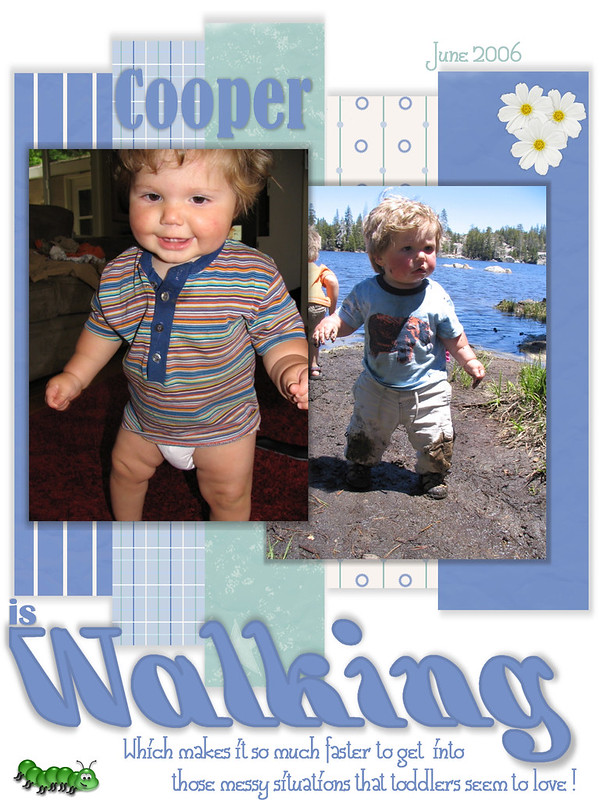
Sorry that I am late this time. I love the pictures and the colors you chose. I myself love shadowing. I think that because of the white background it does seem to be floating. I agree with everyone about adding dirt to the page, but I suggest that you use some grunge. To give a boyish look with a little wear and tear look around the outer edges of elements and page. I love the pictures but I suggest only using the outdoor shot. You could match it with a photo that doesn't leave the outdoor one so far in the back of your layout. Maybe putting brown on the page would have solved that. Boys are so difficult to scrap. There is so much out there to use for girls and women. I think you are on the right track and have the foundation for a great page. Sometimes it takes only one more element, to get the wow factor. Thank you for sharing this moment in his life with us. He sure is a cutie.
Thank you all for your comments. It's nice to hear unprejudiced opinions and advice from experienced scrappers. My style has evolved over the years and I agree with many of the suggestions. Cooper is turning 8 this year and still producing charming situations to be scrapped.
I love the colours; the different shades of blue with the strips. I agree with most of the others that instead of the daisy's maybe use some muddy puddles or mud prints (top right)/foot prints(bottom left). The font is super cute, which one did you use? oh, and the fact the Cooper is absolutely adorable helps, lol. I bet he's going to be a trouble maker ... albeit a cute and adorable one!
I love the different shades of blue used. As the theme is on walking, perhaps you can experiment on including some muddy footprints around instead of the pure and white flowers. Instead of the 2 big photos, having them in different sizes may give the layout more dimension. I certainly won't mind being driven nuts with more photos of Cooper's smiles and cheeks! Thank you for sharing this layout.
Love how you picked colors from the shirt for background and used the strips to accent. In place of daisies maybe a little dump truck with aome dirt in it. I also feel that the Journaling could be a little closer to pictures maybe even overlap a little. I think the size of your pictures is good and the content is great. Thanks for letting us critique I feel we all learn when we share.
Love the photos and the paper choices for a boy. I think the only thing I would do is downsize the text some. I know I like to put my layouts on my desktop (and hide the icons), to see how it will look when I actually get something printed out. Sometimes I do it over and over until it looks rights to me and I might even leave it up all day just to study it before I actually save it for the last time. I like the different fonts you used at the bottom!
What a cutie! Love the cheeks. I think the title piece and journal on the bottom, need to be moved up closer to the picture. My eyes feel distracted moving up and down between the pictures and the words. I love the paper strips, but I also think that the pictures need to be more grounded with a frame or a mat behind them. The strips just aren't enough by themselves even though I love them. I agree with Sarah about the daises and adding in more bugs and mud puddles. I really love colors. They work well with the photos and help them stand out. :)
I think your page is adorable. Coopper is really cute. The only thing I´d do is to decrease a bit the size of the shadows, so things don´t seem to be floating. I know it´s easier to make than to do, as I also have problems shadowing. My favorite part of the layout is the title/journalling. It´s a great and fun quotation :)
I like your use of paper strips and the photos on top of them. The daisies don't seem quite right to me for a messy boy page. I keep thinking of more boy elements like more bugs and some mud puddles for your elements, perhaps. That would go along with your journaling. I absolutely love the photos of Cooper. I just want to pinch those adorable cheeks! Thanks for sharing your page with us.