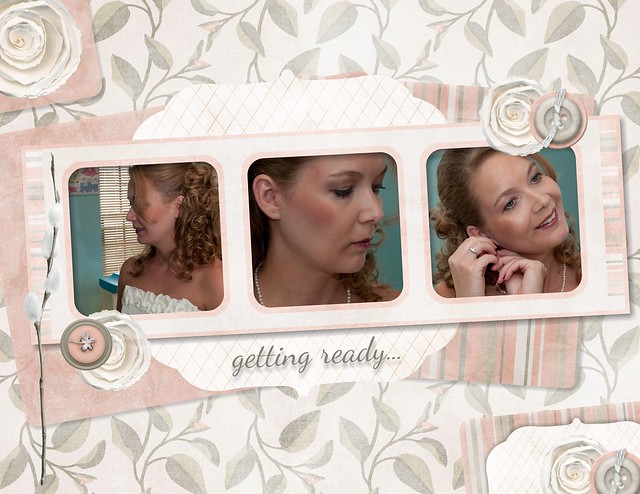
Layout Critique #5
This week's layout comes from Emily.
Please follow the directions carefully. Be specific and make a "good feeling sandwich" (something you like, something you'd improve, something you like). Comments that do not follow the guidelines may be deleted.
I'm hoping to make this a regular feature on the blog. If you'd like to submit a layout for critique please email it to me at [email protected]
Blog By

Subscribe to this blog
![]()
![]()
My Projects


Follow Marisa Lerin
Monthly archive
- November 2012 (9)
- December 2012 (37)
- January 2013 (17)
- February 2013 (13)
- March 2013 (20)
- April 2013 (26)
- May 2013 (29)
- June 2013 (9)
- July 2013 (8)
- August 2013 (13)
- September 2013 (16)
- October 2013 (14)
- November 2013 (16)
- December 2013 (12)
- January 2014 (15)
- February 2014 (9)
- March 2014 (15)
- April 2014 (11)
- May 2014 (4)
- June 2014 (9)
- July 2014 (8)
- August 2014 (7)
- September 2014 (8)
- October 2014 (13)
- November 2014 (6)
- December 2014 (3)
- January 2015 (13)
- February 2015 (14)
- March 2015 (14)
- April 2015 (13)
- May 2015 (12)
- June 2015 (11)
- July 2015 (10)
- August 2015 (8)
- September 2015 (7)
- October 2015 (10)
- November 2015 (8)
- December 2015 (10)
- January 2016 (7)
- February 2016 (6)
- March 2016 (8)
- April 2016 (7)
- May 2016 (8)
- June 2016 (8)
- July 2016 (6)
- August 2016 (5)
- September 2016 (8)
- October 2016 (8)
- November 2016 (11)
- December 2016 (7)
- January 2017 (6)
- February 2017 (12)
- March 2017 (10)
- April 2017 (7)
- May 2017 (9)
- June 2017 (9)
- July 2017 (10)
- August 2017 (7)
- September 2017 (11)
- October 2017 (8)
- November 2017 (9)
- December 2017 (8)
- January 2018 (8)
- February 2018 (8)
- March 2018 (8)
- April 2018 (4)
- May 2018 (9)
- June 2018 (9)
- July 2018 (4)
- August 2018 (5)
- September 2018 (13)
- October 2018 (19)
- November 2018 (18)
- December 2018 (14)
- January 2019 (23)
- February 2019 (20)
- March 2019 (17)
- April 2019 (14)
- May 2019 (17)
- June 2019 (14)
- July 2019 (8)
- August 2019 (3)
- September 2019 (14)
- October 2019 (17)
- November 2019 (16)
- December 2019 (6)
- January 2020 (14)
- February 2020 (20)
- March 2020 (16)
- April 2020 (18)
- May 2020 (19)
- June 2020 (16)
- July 2020 (8)
- August 2020 (5)
- September 2020 (8)
- October 2020 (10)
- November 2020 (10)
- December 2020 (7)
- January 2021 (4)
- February 2021 (9)
- March 2021 (8)
- April 2021 (7)
- May 2021 (7)
- June 2021 (7)
- July 2021 (10)
- August 2021 (7)
- September 2021 (8)
- October 2021 (5)
- November 2021 (7)
- December 2021 (6)
- January 2022 (5)
- February 2022 (7)
- March 2022 (9)
- April 2022 (6)
- May 2022 (7)
- June 2022 (4)
- July 2022 (2)
- August 2022 (1)
- September 2022 (3)
- October 2022 (6)
- November 2022 (4)
- December 2022 (6)
- January 2023 (4)
- February 2023 (5)
- March 2023 (6)
- April 2023 (5)
- May 2023 (5)
- June 2023 (5)
- July 2023 (5)
- August 2023 (5)
- September 2023 (5)
- October 2023 (4)
- November 2023 (4)
- December 2023 (5)
- January 2024 (4)
- February 2024 (5)
- March 2024 (5)
- April 2024 (2)
Recent Comments
Beautiful layout.
This is a beautiful layout. I love the "getting ready' theme and selection of photos. My only comment is that the photos are so much bolder than the rest of the layout that a darker touch somewhere else might balance it a little. Maybe a deeper gray or pink border or deeper elements added to the corner clusters. A touch of teal would work too. The layout is so well organized that it really spotlights the photos.
I really love where everything is placed on the page. Good job! I do agree with the other comments about shadowing and moving the buttons behind the flowers. I think the background and elements blend together too much and some elements need more definition. I really like the teal in the background of the photos. It draws us into your photos. The color photos make me feel like I'm right there with you. That being said, I think that if you want to keep the teal, it would be nice to have touches of that color in the layout as well as the photos. Such a fun idea for a layout! I wish I had photos of myself getting ready for my wedding. Something to remember for the future!
when I say "behind of the papers", please read "behind of the flowers". Sorry!
Really nice and soft layout. The colors of the papers supplement the soft colors of her face. The only thing I would change is the shadowing. The shadowing on the papers is quite heavy, whilst the shadowing on the elements is not there or at least not visibly. In real life it would be the other way around. Shadow papers and title slightly and make the shadows on your flowers and buttons bigger. Pay extra attention to the shadow of the willow branch, that will make it come to life. Don't change another thing about this layout, I think it's lovely!
This is really a gorgeous layout! I adore the soft, feminine color scheme. I also love the arrangement of the papers and elements as well as the paper shadowing. Everything looks balanced. All of that said, I think there's one thing that may improve the layout slightly. If it were my layout, I would convert all of the photos to a bright black and white. The teal wall in the background distracts a bit from the layout. I think changing the photos may streamline the layout even more. Again, fabulous job on layering and balancing the layout so well. It really is gorgeous!
PS: I really do need to do something with my wedding photos as well. Argh...that would be a long term project!
I also love your layout. For me, it´s balanced and I love the colors and papers you used. Even the realistic roses - that are something I usually don´t like, feels perfect on your page. But, If I hade to change something, I´d rescale down the buttons, and put them behind, and not in front of the papers. Your photos are simply fantastic and the way you organised the papers behind the paper strip is great, but I´d change the shadows, because the bracket paper doesn´t seem to be shadowed at all. Maybe putting the same shadow you used on the little bracket on the bottom will work. then, you can reduce the size of the shadow on your title, and add a bit more of shadon on the striped paper on the bottom (maybe copying the big striped paper?), in a way your layout is really consistent. The filmstrip you used is absolutelly fantastic. Did I mention that the background paper matches so well the rest of the layout? Layouts like yours are the only reason I regret don´t having a more traditional wedding. I´d like to have a cute wedding album :)
I really like this layout and I honestly can't find anything that I would change. Your elements balance nicely, the background colors are a nice and allow your photos to be the emphasis of your page. You look so lovely in your photos!
I love the feminine look of this layout. Soft colors match the touching moments for the photos. THe only thing I see that is a little different but not a bad thing is the pussy willow. It's kind of by itself like maybe it could be cluster with a text memory.