Layout Fix #3: Making a Double Layout
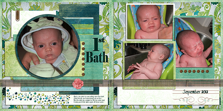
Today's layout was submitted by Kimmie.
This layout has lots of good things going for it. And either of these pages by themselves would be fine, however when taken together as a double layout, I think it's missing some continuity. There isn't much flow between the two pages, and since they are photos of the same event, I think you want them to blend together rather than standing apart as they are now.
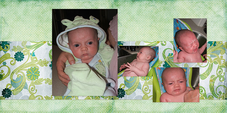
My first step was to make a band across both pages and to turn off all the layers except the photos so I could lay them out without any distractions. This is what I came up with. Notice that the big photo is over the middle line, just enough so that you won't lose anything important to the crease, but to still bring the two pages together.
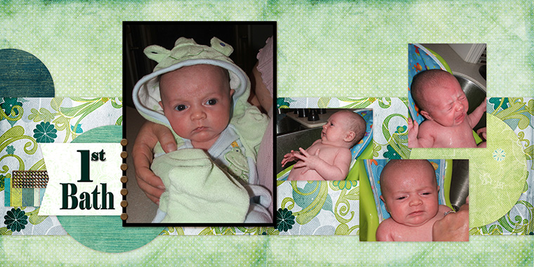
Next, I wanted to place the title. I often leave the title until the end, which creates a problem when there's no where left to put it. If you're going to have a title, put it on early so you can be sure it has good placement. I also added some circles in the background to help move the layout from one side to the other.
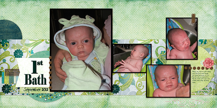
For the next step I added in the journaling and date.

Now the boring part is over and it's time to have fun. Let's put on some elements! Keep in mind that the elements have purpose beyond decoration and should be grouped with some intentionality so the eye continues moving across the page
To finish, I've added a few more papers layers to highlight the photos and tweaked my elements a bit.
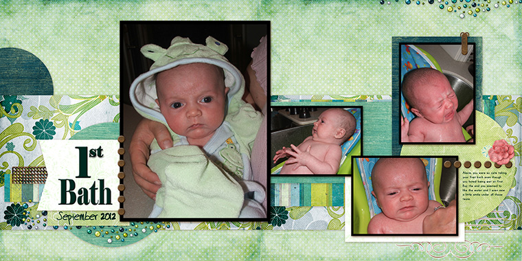
What do you think? How did I do?
If you have a layout you'd like me to "fix" please email it to [email protected]. You'll likely need to zip the file and use a file sharing service (Google Drive, Dropbox, etc) to share such a large file. I will reply to your email to let you know I've received it. If you haven't heard from me after a day or two, try sending it again.

Blog By

Subscribe to this blog
![]()
![]()
My Projects


Follow Marisa Lerin
Monthly archive
- November 2012 (9)
- December 2012 (37)
- January 2013 (17)
- February 2013 (13)
- March 2013 (20)
- April 2013 (26)
- May 2013 (29)
- June 2013 (9)
- July 2013 (8)
- August 2013 (13)
- September 2013 (16)
- October 2013 (14)
- November 2013 (16)
- December 2013 (12)
- January 2014 (15)
- February 2014 (9)
- March 2014 (15)
- April 2014 (11)
- May 2014 (4)
- June 2014 (9)
- July 2014 (8)
- August 2014 (7)
- September 2014 (8)
- October 2014 (13)
- November 2014 (6)
- December 2014 (3)
- January 2015 (13)
- February 2015 (14)
- March 2015 (14)
- April 2015 (13)
- May 2015 (12)
- June 2015 (11)
- July 2015 (10)
- August 2015 (8)
- September 2015 (7)
- October 2015 (10)
- November 2015 (8)
- December 2015 (10)
- January 2016 (7)
- February 2016 (6)
- March 2016 (8)
- April 2016 (7)
- May 2016 (8)
- June 2016 (8)
- July 2016 (6)
- August 2016 (5)
- September 2016 (8)
- October 2016 (8)
- November 2016 (11)
- December 2016 (7)
- January 2017 (6)
- February 2017 (12)
- March 2017 (10)
- April 2017 (7)
- May 2017 (9)
- June 2017 (9)
- July 2017 (10)
- August 2017 (7)
- September 2017 (11)
- October 2017 (8)
- November 2017 (9)
- December 2017 (8)
- January 2018 (8)
- February 2018 (8)
- March 2018 (8)
- April 2018 (4)
- May 2018 (9)
- June 2018 (9)
- July 2018 (4)
- August 2018 (5)
- September 2018 (13)
- October 2018 (19)
- November 2018 (18)
- December 2018 (14)
- January 2019 (23)
- February 2019 (20)
- March 2019 (17)
- April 2019 (14)
- May 2019 (17)
- June 2019 (14)
- July 2019 (8)
- August 2019 (3)
- September 2019 (14)
- October 2019 (17)
- November 2019 (16)
- December 2019 (6)
- January 2020 (14)
- February 2020 (20)
- March 2020 (16)
- April 2020 (18)
- May 2020 (19)
- June 2020 (16)
- July 2020 (8)
- August 2020 (5)
- September 2020 (8)
- October 2020 (10)
- November 2020 (10)
- December 2020 (7)
- January 2021 (4)
- February 2021 (9)
- March 2021 (8)
- April 2021 (7)
- May 2021 (7)
- June 2021 (7)
- July 2021 (10)
- August 2021 (7)
- September 2021 (8)
- October 2021 (5)
- November 2021 (7)
- December 2021 (6)
- January 2022 (5)
- February 2022 (7)
- March 2022 (9)
- April 2022 (6)
- May 2022 (7)
- June 2022 (4)
- July 2022 (2)
- August 2022 (1)
- September 2022 (3)
- October 2022 (6)
- November 2022 (4)
- December 2022 (6)
- January 2023 (4)
- February 2023 (5)
- March 2023 (6)
- April 2023 (5)
- May 2023 (5)
- June 2023 (5)
- July 2023 (5)
- August 2023 (5)
- September 2023 (5)
- October 2023 (4)
- November 2023 (4)
- December 2023 (5)
- January 2024 (4)
- February 2024 (5)
- March 2024 (5)
- April 2024 (2)
Recent Comments
I really love this exercise. Simplifying the elements like you did, Marisa, really allows the photos to stand out more, and the circles soften it. I have one concern and one suggestion. I am concerned that the large photo on the left crosses the midline - this means that if it is going into an album after being printed the pages will look a bit funny on the inner edges. If it is printed as a book then the sweet face of the baby will be rolling into the fold. In the same way the left photo on the right page bumping against the larger one on the left page looks like it wants some separation. My suggestion is to move the photo of the baby looking to the left to the bottom right of the right page, and the crying baby to the left and then the lower photo up. this allows the 'movement' of the body and the gaze to assist in moving our eyes circling around the page. I hope that makes sense. :-D
Wow! You make it look so easy, Marisa. Gorgeous layout.
I love the transformation ... looks amazing.
Kimmie, I made a quick tutorial here that I hope will answer your questions: https://www.digitalscrapbook.com/forums/digital-scrapbooking/tutorials/working-with-double-layouts-video
I really like the fix. I say: Just keep on playing around. And like Marisa once said, try to scraplift a lot, your skills improve by the layout :-). I can't help you with the PSE thing because I never used it. Maybe someone else has a tip or can help you with that one.
I really like your new design. The circles and picture layout make it look so clean.
Since this was my first digi layout I initially did it as one page (as a test) with lots of layers because that's how I paper scrap, then added the second page to get more photos to help tell the story so your comments are valid - it really was two separate pages!
Being a real newbie, I'm not sure how to make a true two page layout (background 24x12) in PSE so that I can print it out using my printer. Anyone out there have any thoughts? Because I'd love to make these changes! :) Thanks!
This layout fix is right on the money! Awesome color and I love that the picture on the left has been made the focal point of the spread. Would have never thought to use the confetti (?) and on the layout. It does give it a "bubble" feel.